Art in the Garden at
Portland Japanese Garden
Key Visuals, On-site posters, Gallery guide Booklets, Billboard Advertisements, Postcards, Gallery space wall vinyls
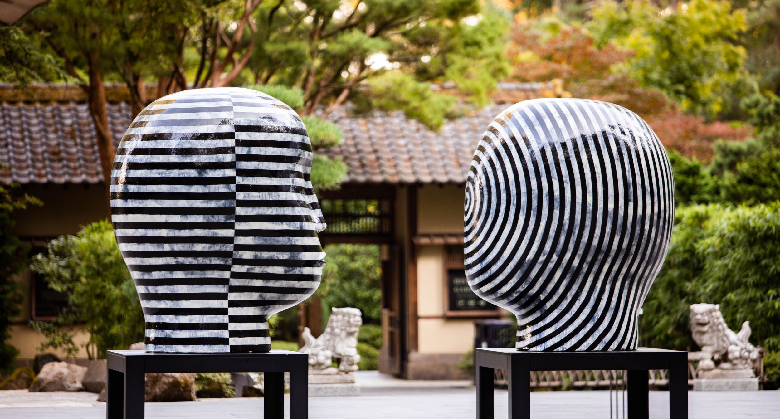
In October of 2022, Portland Japanese Garden was delighted to welcome internationally acclaimed artist Jun Kaneko (b. 1942-). Kaneko’s famously large and evocative outdoor ceramic statues were installed across the spectacular garden spaces, creating a stunning juxtaposition with the fiery reds and oranges of our maples in fall. This was in addition to more intimate pieces from the nearly 60 years of Kaneko’s marvelous career, including paintings and works on paper.
As the staff Graphic Designer at Portland Japanese Garden, I was tasked with planning and executing key visuals and marketing materials for this prestigious on-site exhibition. I conducted extensive independent research on the artist, coordinated with our art curators, and implemented input from Kaneko’s staff in order to achieve the perfect key visual that could capture the identity of this exhibition. Once our key visual was established, I applied the design language to various marketing materials such as gallery guides, wall graphics, billboard ads, posters, postcards, tote bags, and more.
Creating the Key Visuals
Portraying resonance, interaction, nature, and scale.
To allow his artworks to connect with their surroundings and with viewers, Kaneko refuses to define his work’s story. Instead, he aims for the art to resonate with the space and people around it. To him, space is not something abstract, but is alive and organic, creating interactions between his works and the environment they’re situated within.
The key visuals for this exhibition needed to bring these ideas to life. In order to have these elements reflect the artwork of Jun Kaneko, they needed to be organic, larger than life, and feel like they are connected to both humanity and nature.
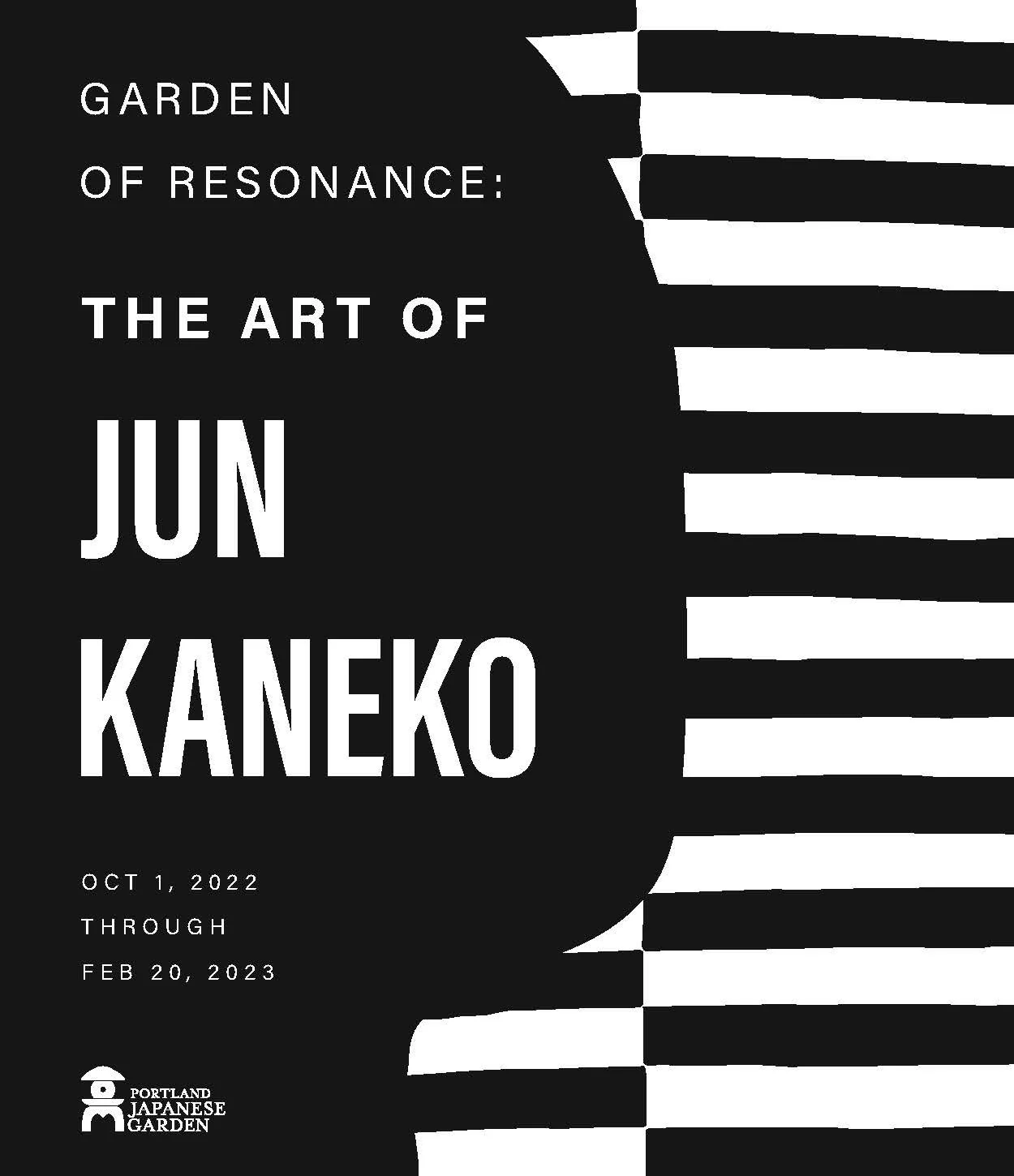
The visual we came up with uses the hand-painted line work from both of Kaneko's large head ceramic pieces and overlaps them into one image. The simplicity of the head’s silhouette is accented by the more complex, hand-drawn lines from the corresponding head, which then make up the background. These two elements together illustrate the contrasting, complex, and organic lines that exist alongside the more simplistic outlines and colors. Much like the actual artwork, the more simple side of the composition leaves space for the surrounding information to shine. The large head outline in this key visual gives space for not only the title text to breathe, but also be used as a dynamic frame for imagery of the Garden. Using the head silhouette as a frame for Garden images and textures is a representation of how this artwork is able to uniquely interact with the Garden surrounding the viewer.
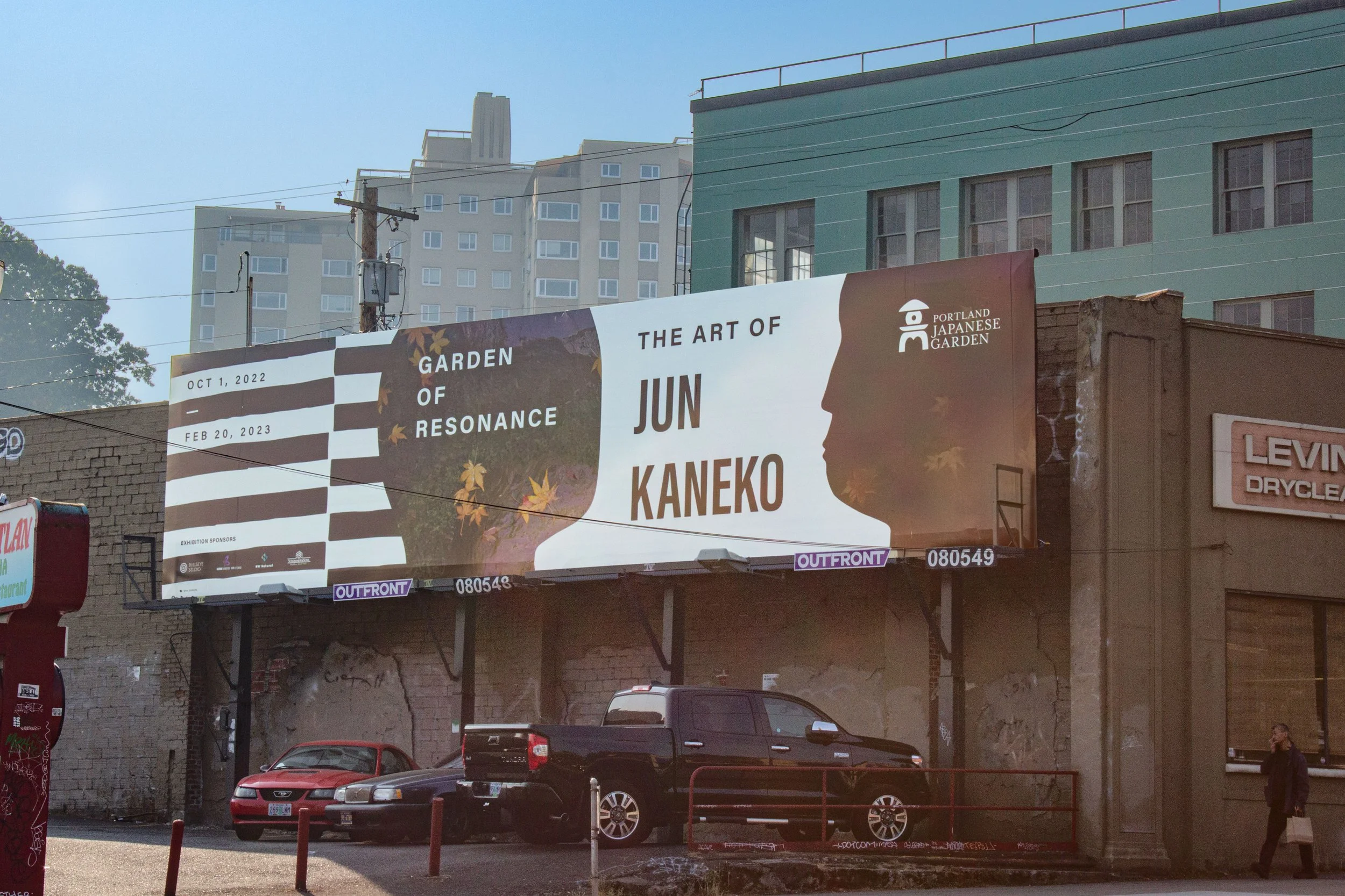
Billboard on W Burnside
Billboard on W Burnside
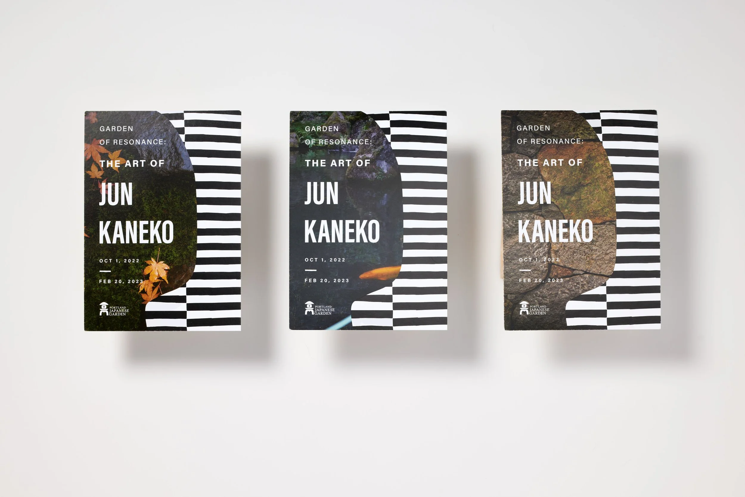
Exhibition Gift Shop Postcards
Exhibition Gift Shop Postcards
Wall Graphic in Pavilion Gallery Space
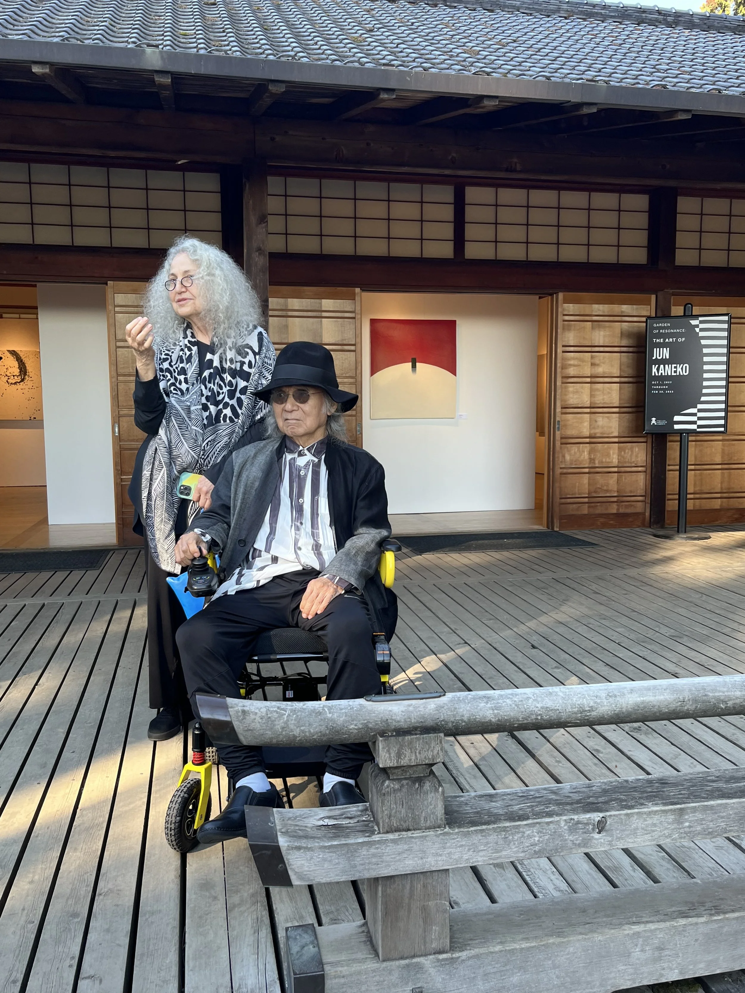
Artist Jun Kaneko visiting the Garden of Resonance Exhibition, in front of the Pavilion Gallery space and key visual Poster


